
today we had our termly 'now that's what I call painting' visual mixtape, presented by tom and zoë, via teams. and both of theirs were really great, there were some inspiring things to see. In this post I'm going to make notes on zoë's video (and tom in the next post*) :
~ mixtape dinner party with artists who have possibly never met ~
- John Baldessari
[it seemed important, he said, that I test this other premise, whether a person has to do his or her own work, or can it just be a thought process. This came out of reexamining what art was supposed to be. And one of the fundamental assumptions, I suppose, and it still lingers, is that there should be the artist's touch in there in some way. otherwise it's not art. So all that stuff is going on inside my mind at the time, and I said again, what's so bad if I didn't do it?]
(talking about 'Commissioned Painting' paintings)

Hope (Blue) Supported by a Bed of Oranges (Life):
Amid a Context of Allusions, 1991
'John Anthony Baldessari (June 17, 1931 – January 2, 2020) was an American conceptual artist known for his work featuring found photography and appropriated images. He lived and worked in Santa Monica and Venice, California.
Initially a painter, Baldessari began to incorporate texts and photography into his canvases in the mid-1960s. In 1970 he began working in printmaking, film, video, installation, sculpture and photography. He created thousands of works which demonstrate—and, in many cases, combine—the narrative potential of images and the associative power of language within the boundaries of the work of art. His art has been featured in more than 200 solo exhibitions in the U.S. and Europe. His work influenced that of Cindy Sherman, David Salle, Annette Lemieux, and Barbara Kruger among others.'
https://www.widewalls.ch/john-baldessari-art-auction-works/font-1987/ (all text below from this article)
'As one of the leading figures and determining forces of the late 1960s conceptualism, John Baldessari relied heavily on the linguistic play and upon appropriating and recontextualizing images. This way, he disrupted the relationship between sign and signified, between convention and unconscious meaning. Questioning the very notion of art and artistic practice he explained that he “was able to dig into what I thought art might be, not what somebody else would think art would be”. His works are often riddles highlighting some of the unspoken assumptions of contemporary art. Creating complex compositions exploring the multifaceted interpretations of cultural iconography, he always maintained his signature sense of humor.
Beginning in the 1950s, Baldessari emerged through works executed in a gestural style. Abandoning painting altogether, he burnt all of his early works, turning them into dust that he kept as a souvenir until his death. He wanted to discover a way to create pictorial art without making “paintings”. By the end of the 1960s, the artist started to introduce text and appropriated images. Focusing on the photographic image, he explored the ways these they communicate. Employing distorting, cropping, collaging, blocking out faces and objects with colored dots, he would often arrange them to suggest a narrative.
Baldessari described himself as a “frustrated writer, less interested in the form art takes than the meaning an image evokes”. Introducing text into his works, he realized that imagery and text behave in similar ways through codes that convey messages. His versatile portfolio includes photomontage, artist’s books, prints, painting, film, performance, and installation. His emergent “anti-style” idiom of photographic and filmic mash-ups, deadpan humor, and canny juxtapositions became the language of Conceptual Art and have had an enormous influence on generations of artists.'
Commissioned Painting: a Painting By Edgar Transue, 1969
This piece was sold at Sotheby’s New York in May 2014 for $2,517,000.'
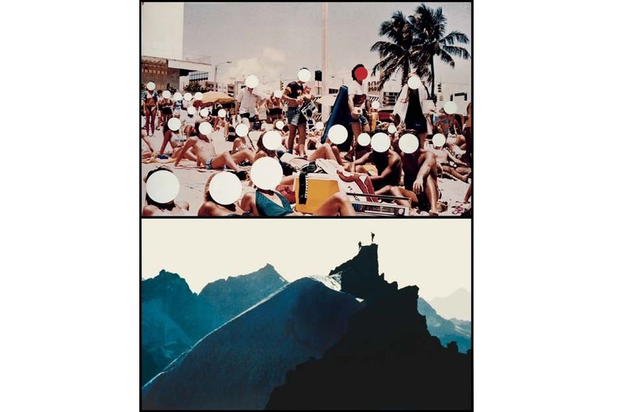
Figures at Beach; Figures on Mountain Peak, 1990
The piece Figures at Beach; Figures on Mountain Peak from 1990 juxtaposes the imagery of the crowded beach with a mountain peak conquer. Facial expressions of the beach figures are obscured with his signature geometric shapes. Baldessari found his medium in a readily available resource of mass culture; the discarded photograph that could be recombined and altered to yield new configurations of meaning.

Quality Material, 1968
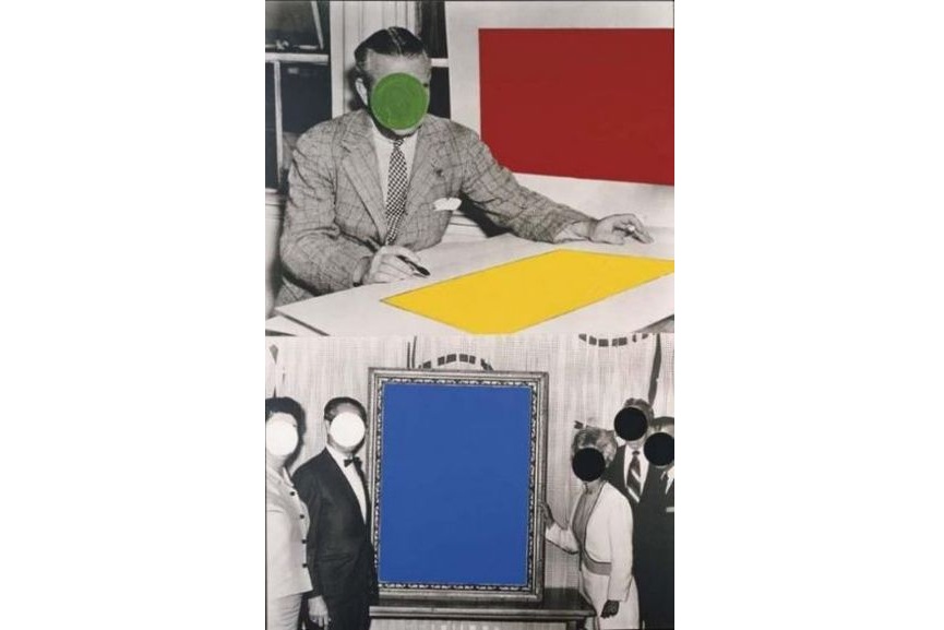
Font, 1987
'In the piece Font from 1987, Baldessari incorporates flat, geometric shapes of color to change the meaning of appropriated imagery. Focusing on a workplace achievements that Baldessari believed to be arbitrary, facial expressions of the figures and some other detail that would particularize the events are obscured with. These banal rituals are therefore mocked for its absurdity. The work emerges from reflections on public interaction in the modern world, where one’s individuality is submerged in the interests of the group.'
'A Brief History of John Baldessari'
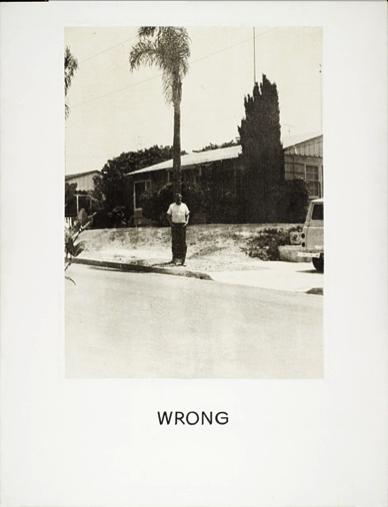
[taken photographs intentionally with bad compositions and called it 'wrong']

[Hot & Cold, Marian Goodman gallery https://www.mariangoodman.com/exhibitions/6-john-baldessari-hot-cold/ ]
[collector of film stills of different subjects e.g. guy riding a horse]
[one day put the dot stickers on the faces, felt like it levelled the playing field]
[exhibition pure beauty travelled around the world - starting from tate]
[three things for the young artist 1; talent is cheap 2; you have to be possessed which you can't will 3; being at the right place at the right time]
'In 1970, the American artist John Baldessari cremated every painting he had made between 1953 and 1966, and promised not to make any more boring art. In the ensuing years, he has created countless works across a range of media; his art has travelled the world, and he has been hailed as a surrealist for the digital age. But who is John Baldessari, really? Narrated by the singer-songwriter Tom Waits, and overflowing with grand ideas and amusing footnotes, this film is a glimpse into the life of an artistic giant.'
- Lucy Mckenzie
[Regarding Romanticism, the actual fabrication of my work is extremely dispassionate because I’m using techniques that are purely about procedure. They were taught to people 150 years ago who weren’t artists, they were just 16 years old learning how to make fake wood or fake marble, or how to paint a woman’s face the way you should paint it if you have to do it 50 times ‘round a dado rail. It’s as formulaic as Stephen King or Patricia Highsmith, a kind of trick bag. My allowance of Romanticism is placed in how the images I paint, or things I want to make, are chosen. In the past my adolescence seemed to be extremely important to me, but now that I’ve started making clothes I’ve been thinking much more about my childhood and my mother. She has a senior position in a domestic violence charity, and brought me up to think I could do anything I wanted. Yet my sister and I were dressed in sweet velvet dresses and we flounced around like Kate Greenaway characters. That for me is very romantic, the double message of feminine whimsy and female empowerment.]

 Untitled, 2005
 Quodlibet XII (Steven Purvis), 2011, oil on canvas


- Ellen Gallagher
 DeLuxe, 2004-5
'The imagery for this print series is based on magazines dating from the 1930s to the 1970s aimed at African-American audiences, many of which feature advertisements for ‘improvements’ including wigs, hair pomades and skin bleaching creams. Gallagher transformed these images using a variety of printing techniques, combining traditional processes of etching and lithography with recent developments in digital technology. She also made modifications by cutting and layering images and text and adding a range of materials including plasticine, glitter, gold leaf, toy eyeballs and coconut oil. Her witty and sophisticated interventions emphasise the complex construction of identity.
Gallery label, November 2007'
[I guess what you’re saying about the poetic or historic is, moving through these magazines in the way I did, at a speed of you know, once a month, and also looking over time periods from the 30s into the 70s, you start to see the vantage points, concepts that had seemed fixed, you see them shift and you also see them shift in the magazine from, in the 30’s where it’s about assimilation and integration and that’s not questioned after WW2 and that disappointment, there’s a projected question of, a kind of disappointment with integration…]


(from tate) 'DeLuxe is a portfolio of sixty individually-framed prints hung in a rectangular grid formation comprising five rows of twelve, arranged in a sequence fixed by the artist. The work’s raw materials are advertisements drawn from magazines dating from the 1930s to the 1970s aimed at African American consumers, such as Ebony, Our World and Sepia. Extracts of textual advertisements and images of mainly female models have been cut and layered to create the effect of a collage. These advertisements promote a range of beauty products for women and men, especially goods relating to hair including wigs and pomades. Other publicity materials advertise items including slimming aids, underwear, feminine hygiene items and skin treatments, such as bleaching creams. Gallagher employed a variety of techniques to transform the advertisements, combining traditional printing processes of etching and lithography with recent developments in digital technology. The printed pages are principally black and white, but are punctuated by areas coloured grey, pink and red. With the title DeLuxe Gallagher draws ironically on the language of the advertisements as part of her project of subverting their original intentions; the word ‘deluxe’ appears in various spellings and fonts in different places in the prints...'
 Untitled, 2006
'The imagery for this print series is based on magazines dating from the 1930s to the 1970s aimed at African-American audiences, many of which feature advertisements for ‘improvements’ including wigs, hair pomades and skin bleaching creams. Gallagher transformed these images using a variety of printing techniques, combining traditional processes of etching and lithography with recent developments in digital technology. She also made modifications by cutting and layering images and text and adding a range of materials including plasticine, glitter, gold leaf, toy eyeballs and coconut oil. Her witty and sophisticated interventions emphasise the complex construction of identity.
Gallery label, November 2007'
[I guess what you’re saying about the poetic or historic is, moving through these magazines in the way I did, at a speed of you know, once a month, and also looking over time periods from the 30s into the 70s, you start to see the vantage points, concepts that had seemed fixed, you see them shift and you also see them shift in the magazine from, in the 30’s where it’s about assimilation and integration and that’s not questioned after WW2 and that disappointment, there’s a projected question of, a kind of disappointment with integration…]

Untitled, 2006
- David Korty
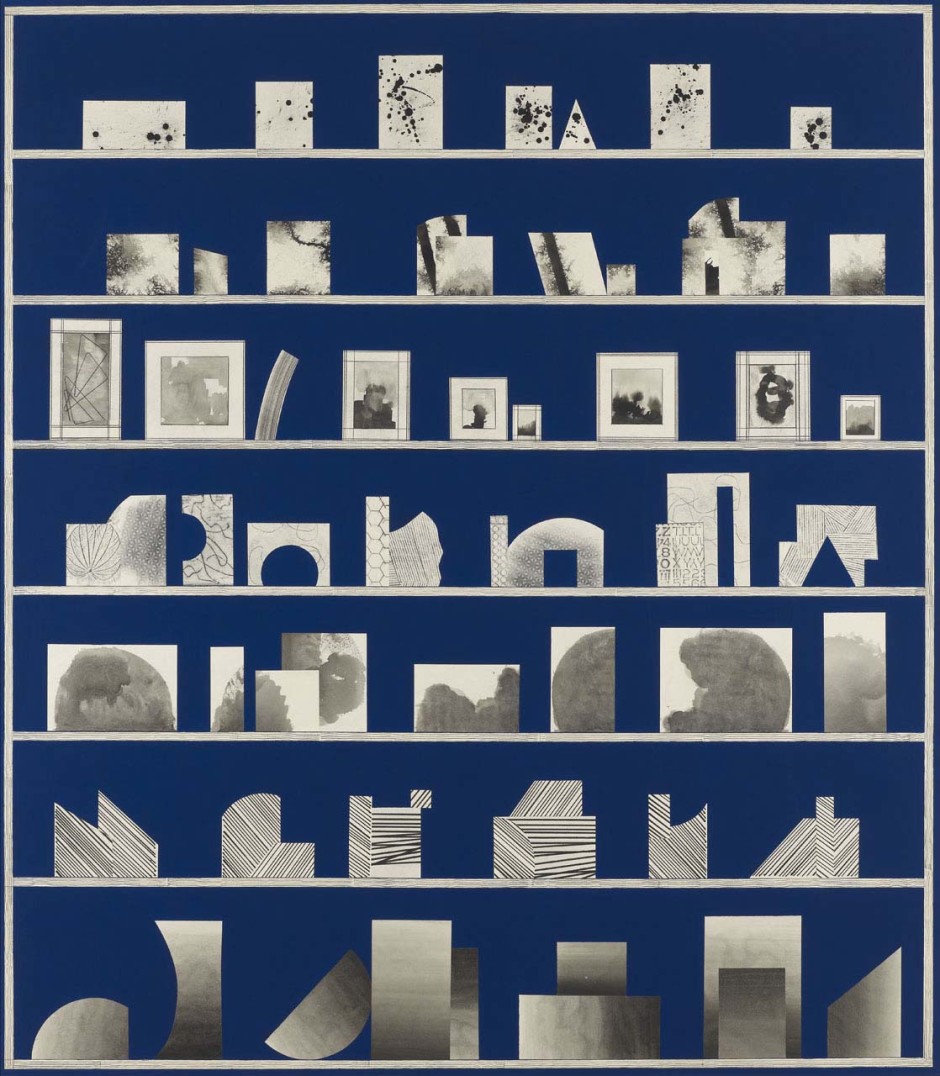
 Blue Shelf 8, 2013
 Blue Shelf 14, 2013
[I think that good painters do work hard. And sometimes for long periods without seeing much improvement or progress. The process of making paintings involves a lot of trial and error. Things need to be worked out on a surface but it takes time for that to happen.]
'David Korty (b. 1971, California) studied an MFA at the University of California, Los Angeles (CA)(1998) following a BFA at Rhode Island School of Design, Providence (RI)(1992). Korty is a painter whose works distil the human figure, urban landscape and still life subjects into subtle arrangements of pattern, colour and shape. Employing collage, ink and pencil, Korty’s sensitivity to colour and contour combine with his formalist interest in surface, outline and the interplay of two-dimensional and three-dimensional space to create works that variously echo the angular configurations of origami, the simplified linearity of architectural plans, and the encoded appearance of arrayed symbols or hieroglyphs.'
- Lisa Sanditz

Sock City, 2012
[If you own it there’s a city in china named after it. There’s underwear city and bra city and flooring city and decoration and hardware city and everything. I read an article that mostly focuses on sock city and how they produced billions of pairs of socks enough for every person in the world have a pair of socks out of this town every year. And I just thought this was such a fascinating model, and of course parallel(?) to model that’s familiar to us in this country I tell people I go back to sock city, underwear city, and they think it’s totally crazy but you know, there’s Detroit motor city, and living around here…Another thing I read about it that tied it to the American landscape was that because of the industrial transition there, a lot of the things that are completely familiar to our landscape and foreign to theirs, being highways and billboards, the way the cities are growing quickly, structuring, so all that interested me in going over there.]
 from 'Surplus' series, 2012


 from 'Underwear City' series, 2012

from 'Underwear City' series, 2012
https://lisasanditz.com/why/
STATESIDEThe paintings in “Stateside,” depict sites I have discovered in the American landscape that reflect what is happening in the culture and economy at large. Following three years of work based on single-industry cities in China intended to examine the essential home of the global economy, I wrestled with what subject matter might make sense of the meltdown. The expressive and subjective “Sock City” paintings examined how the consumer-based relationship between China and the United States affects the Chinese landscape. So, what to do after going big? Go small and start at home.
I began this new body of work painting plein air paintings around my upstate New York home, a landscape with a long history of economic change. These paintings eventually led me to a few other locations that had visually or politically-charged locations throughout the country.
At times these locations contain visual elements that seem ripe for painterly interpretation, such as “Silverlake Reservoir,” which is based on the drinking water reservoir in the city of Los Angeles that was filled with 400,000 black balls to prevent sunlight from stimulating the growth of a cancerous material in its waters. Other sites may appear visually barren, but provide an opportunity for painterly description/ “Kingston Pontiac” depicts a northeastern small city’s failing car dealership as expressed through a mass of polyurethane sliding off the canvas, suggestive of the fleeting prosperity and materiality of the car industry in America.
The ways that the painted space and the physical space interact is always a point of intrigue for me. For example, a few years ago I happened upon a laboratory in swampy southern Florida that tested the lightfast and weatherproof attributes of many household and industrial materials. There were acres of tables containing a multitude of colors and materials, organized into a literal color field, as depicted in the painting, “Q lab Color Field”.
In this new work, color is fickle. At times it calls attention to something artificial, at other times its saturation indulges vibrant autumnal colors, and occasionally is muted as affected by a heavily particulated atmosphere.
These new paintings connect my earlier paintings of the American landscape with the formal and conceptual concerns I tackled in the “Sock City,” paintings, and are located in the other side of a once booming economy.
- Tal R
 Cousins
[ I basically always wanted to do artworks which is about my surroundings, about what I experience when I see something, so simple that you almost don’t wanna say it, it’s like, to do a painting of just what is around you, it’s what you start with, and then you put it away for years because that’s just too simple. But in a way to do something like this, the artwork is something really really close to you, something that I do a painting, and people, they can take their bike and go down and look at this place, it’s… I don’t know how to explain it, something very magic about it, something impossible. ]

installation at Kunsthalle Düsseldorf
https://www.victoria-miro.com/artists/16-tal-r/
'Working across a diverse range of media including painting, drawing, print, textiles, sculpture and furniture, Tal R questions our conceptions of and presumptions about our surrounding reality – what we’re seeing and where its meaning lies. With their flamboyant colours and exuberantly painted imagery, the paintings for which Tal R first became known give the impression of being simple, almost turning high art into child's play. While they are certainly direct, with paint often squeezed straight from the tube, his canvases in fact wear their sophistication and intelligence lightly. Central to the work is Tal R's profound understanding of painterly tradition which simultaneously accommodates muscular, expressive brushstrokes used to describe people, objects or places, and a stabilising pictorial format informed in part by formalist abstraction. These early paintings are divided into three horizontal bands which can be read by the viewer as levels of different activity.'
'At the same time, Tal R has has often used the word 'kolbojnik', meaning leftovers in Hebrew, to describe his practice of sourcing and collecting a wide range of imagery, figurative and abstract, from high and low culture. Installed collectively, Tal R’s works can eschew adherence to a single aesthetic style in favour of a non-hierarchical exploration of material and form. He is also known for producing unique, hand-made sofas, or ‘opiumbeds’, which are made from old and new rugs sourced throughout Scandinavia and treated with paint and dye in the studio. Neither the practical purpose of these works nor their aesthetic qualities take categorical precedence. The idea of the opium bed suggests a hazy, latent space of unfettered thinking, the functional object delineating a non-functional space of thought. They represent just one way in which Tal R plays with the porous boundary between art and life.'
https://www.saatchigallery.com/artists/tal_r.htm
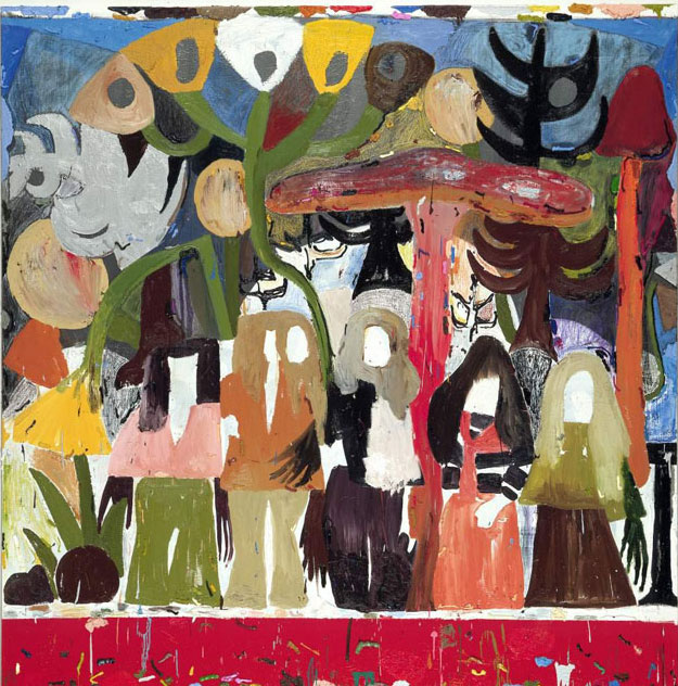
’I do painting a bit like people make a lunch box,’ Tal R explains, ’I constantly have this hot-pot boiling and I throw all kinds of material into it.’ ’Kolbojnik’, the Hebrew word for leftovers, is more than appropriate to describe his home-baked painting style: imaginary pastoral scenes based on his everyday life, rendered in guttural faux abstraction, canvases often literally collaged together like a visual goulash. Sisters of Kolbojnik, depicting an earthy gang of shaggy-haired, bell-bottomed nymphs in a magic-mushroom forest, is a celebration of overlooked wall-flower beauty, as socially inclusive as a community mural.
https://www.saatchigallery.com/artists/tal_r.htm
Sisters of Kolbojnik, 2002
Oil on Canvas, 250 x 250cm
- Mamma Andersson
JS: I read the titles as non-literal. And the works definitely set a mood, but they are also mysterious. When I look at your paintings, they have a peculiar resonance, as if I have been there once before. What part does collective memory or dreams have in your work?
MA: Our collective memory is fascinating. Earlier today, I discussed this with a colleague who has for a long time been traveling with her art students to Berlin once a year. One year, several students did not really know what the Berlin Wall was. Before that year everyone had known. So it seems like not only the memory is collective.When I’m looking for image material as inspiration for my work, I understand how important it is for me that I feel a kind of identity with the images, in terms of time but also psychologically.It was very obvious when I was looking at photographs from different theatre productions. All set designs and costumes which were older than the 50s and 60s were rejected, but the settings from after the 90s felt too young and didn’t amuse me. I want to be a part of the image. If I am a part of the painting, then maybe some viewers can be too.
JS: This kind of subjective association allows viewers to enter the picture, and to some extent, inter-subjectivity. Formally, I like that your works are incredibly varied, employing thick marks up against faint sweeping gestures and intricate patterns. And it gets particularly exciting when there are transparent ghost images or black fissure-like forms. Do your images come together fluidly, within a sitting, or in parts?
MA: They all come in one sweep: it lasts, however, for a long time. One exhibition equals a sweep, a common mood. Each image goes through fire and water. Several paintings are in progress at the same time; they give each other energy. I can rest from a painting until I regain a good eye. The colors in the tubes, brushes, tapes, pigments, paint, sprays, solvents, crayons. I paint slowly, gently, thin, beautiful, ugly, thick, hard. I love it, it’s my life. But I hate it too. I am a painter, and I am always most focused on the actual painting. The other, the psyche, I just have to trust that I can keep up with — it is a quiet, messy, illogical confusing disorder. It is here that dreams and the subconscious come in.
'Characterized by a unique combination of textured brushstrokes, loose washes, stark graphic lines, and evocative colors, Mamma Andersson’s works embody a new genre of landscape painting that recalls late nineteenth-century romanticism while also embracing a contemporary interest in layered, psychological compositions. Her often-panoramic scenes draw inspiration from a wide range of archival photographic source materials, filmic imagery, theater sets, and period interiors, as well as the sparse topography of northern Sweden, where she grew up: mountainous backdrops, trees, snow, and wooden cabins are recurrent elements within her works. Yet, rather than conveying specific spatial or temporal reference points, they revolve around the expression of atmospheres and subjective moods, and frequently appear to merge the past, the present, and the future.'
Hello, 2013
Family Ties, 2013

The Best Storyteller 1, 2005
- Pia Fries

Tisch-mt, 2009

Schwarze blumen ba, 2006
- Rosson Crow
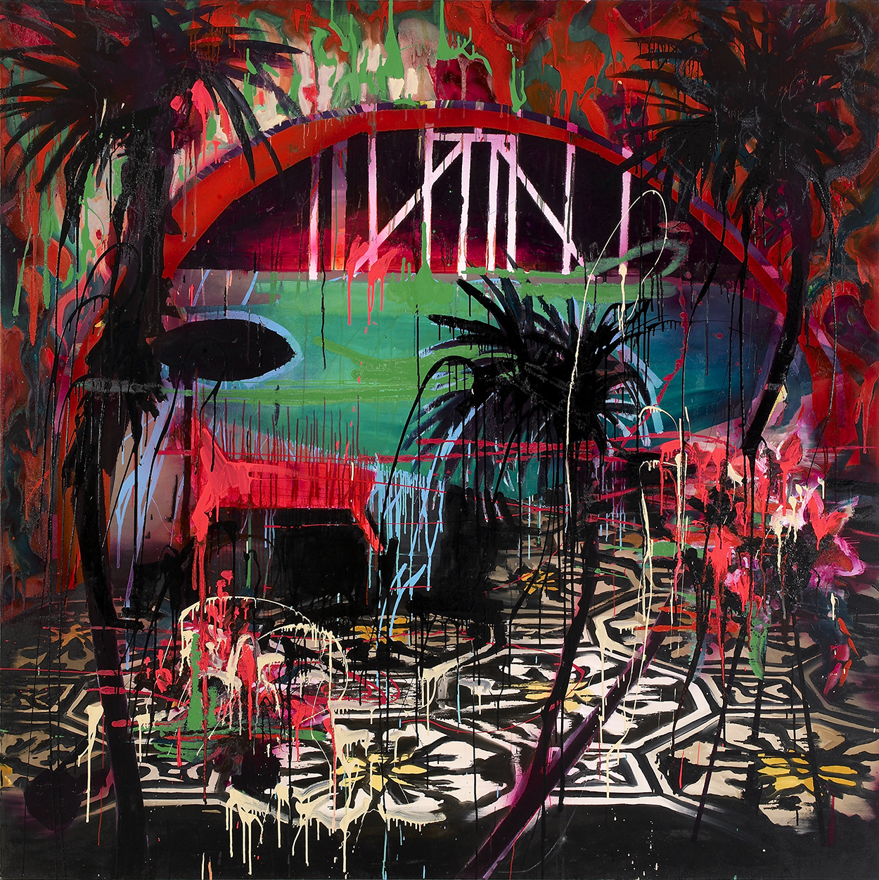
Girl Happy, 2007
[ With all the energy and excess of youth, Rosson Crow (1982) makes paintings in which colours and forms are tumultuously telescoped while the depths are lost in a confusing abstraction. Her paintings are excessive and theatrical and resemble film sets, artificial arrangements bathed in the bright light of spotlights and deserted by the actors. Crow also presents historical interiors as well as artificial environments that she transforms into a projection plane in order to evoke a decadence that is alternately joyful and morbid.
Thus the title of Girl Happy (2007) refers to one of the Sixties comedies. The spectator is placed at a distance by the silhouettes of palm trees set against the light and is faced with a scene in which spatial indications are confounded and the foreground, through the colour of the paint, seems to be cracking open as if it were showing the collapse of a superficial vision. ]


https://visualingual.wordpress.com/2008/10/11/interior-paintings-by-rosson-crow/
' Matthias Weischer’s paintings balance between reality and imagination. Secular painterly themes like the interior and the landscape are the key motifs in his oeuvre. Weischer is interested in the historical perspective of painting; both the medium as well as the classical system of representation.
Weischer’s investigation into the depiction of three-dimensional space is of great importance in his work. He ignores the laws of classical perspective and rather dictates his own. Collage-like painted elements build upon imagery that is as diverse as wallpaper motives, mosaic floors, windows sills, pieces of furniture, loose bricks or part walls, and the occasional reference to a figure or element in settings that range from desolate rooms to lush fields in the countryside. In doing so, Weischer’s special painting technique plays a distinctive part. Like a mason, he constructs his pictures with paint, layer over layer, literally building the image on the canvas.
The multiple layers in Weischer’s work reflect a continuous search for uniting void and substance. His interest in the process of building a composition and searching for the equilibrium of chaos and harmony, places his work on the edge of reality and illusion.'
- Matthias Weischer
' Matthias Weischer’s paintings balance between reality and imagination. Secular painterly themes like the interior and the landscape are the key motifs in his oeuvre. Weischer is interested in the historical perspective of painting; both the medium as well as the classical system of representation.
Weischer’s investigation into the depiction of three-dimensional space is of great importance in his work. He ignores the laws of classical perspective and rather dictates his own. Collage-like painted elements build upon imagery that is as diverse as wallpaper motives, mosaic floors, windows sills, pieces of furniture, loose bricks or part walls, and the occasional reference to a figure or element in settings that range from desolate rooms to lush fields in the countryside. In doing so, Weischer’s special painting technique plays a distinctive part. Like a mason, he constructs his pictures with paint, layer over layer, literally building the image on the canvas.
The multiple layers in Weischer’s work reflect a continuous search for uniting void and substance. His interest in the process of building a composition and searching for the equilibrium of chaos and harmony, places his work on the edge of reality and illusion.'
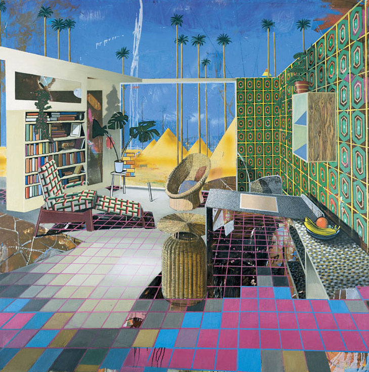
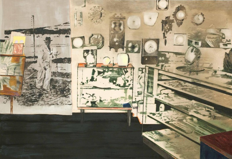
Egyptian Room, 2001
Matthias Weischer’s dream houses defy all spatial logic; he makes architectural installations that can only exist in two dimensions. Depicting a ceiling-less apartment, Egyptian Room removes the ambit between internal and external space. Instead, each element imposes its own sense of order on each other: outside, palm trees and sand dunes tower in geometric precision, while inside Matthias Weischer’s meticulous grid gives way to its own organic confusion. The floor melds inconspicuously with the counter, shelves and table tops tilt to high-seas angles, and objects such as the basket sink below their supporting surfaces. Banality is ruminated as a perpetual labyrinth where obsession and madness become the pursuit of wonder and delight.
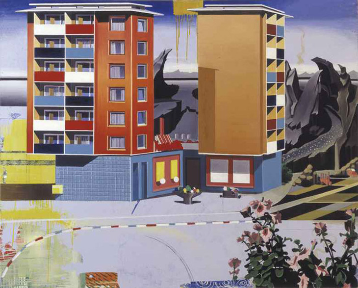
House, 2003
House operates as an antilogy: a painting that’s a contradiction of its own expression. Subverting the expected qualities of painterly rendition, Matthias Weischer invents an environment where each element adopts attributes opposite to their character. Flowers in the foreground recede with the flatness of wallpaper, while rugged mountain backdrops protrude with stylised sharpness. Hard-edged formalist tower blocks exceed planate limitation to create believable sculptural volume, while details nearest in perspective float in non-descriptive nether-space. Smudges and drips of pure abstract gesture should lead the eye directly back to the painting’s surface; instead they create a disorienting tiered perspective. Matthias Weischer creates a common urban scene as a surprise of improbable construction, exploiting illusion to its ultimate possibility.
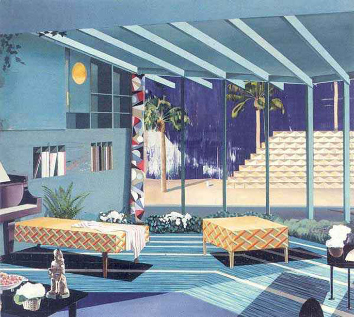
Living Room, 2003
Matthias Weischer’s paintings of interiors expose the architecture of painterly illusion. His rich surfaces contrast geometric fields of hard-edged abstraction with highly rendered decorative details to create an eerie play between flatness and 3D. Starting with a design of an empty room, Matthias Weischer builds his imagined locations layer upon layer, each added element further pushing the boundaries of perceived space. Incongruous perspectives, dizzying patterns and Escher-like visual riddles quietly allude to a sense of the uncanny. In Living Room, suburban normality is infiltrated by an almost unnoticeable surrealism: shrubbery on the inside of the building, an impossibly flat piano and a table that casts no shadow.
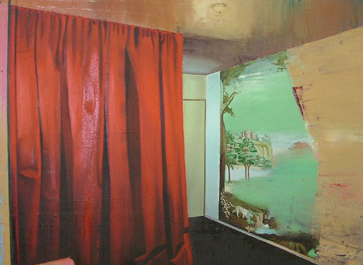
Interior, 2003
Matthias Weischer’s Interior sets up an ambience of corroded decadence. Here Weischer’s formalist interests are presented with more naturalistic qualities. Exploiting his media to its full potential, Weischer creates spatial illusion through his application as well as composition: the heavy folds of the curtain are painted with concrete ballast, while the ceiling writhes with liquid fragility. Weischer renders the receding wall with battered texture, the illusion of movement gives way to a fanciful mural; a portal to a mystical landscape, incongruous with this dilapidated setting.
- Thomas Scheibitz
[ Sometimes I get an invitation for a show called abstract paintings or abstract sculptures, it’s not, I don’t know, it’s not… I think it’s not an issue. Everybody knows what you mean, but when you say this is abstract, this is figurative, but I think it’s a dead end. I’m sure we could find, today, for every totally abstract form, we could find something on the microscope or on the street or in the universe what has a likeness or what looks similar. When you go in a lexicon? abstract means you make it a little more simpler or compact.. ]
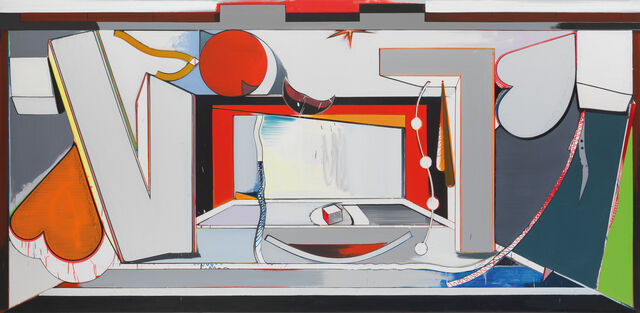
VT Bühne, 2010
Funny Game, 2000
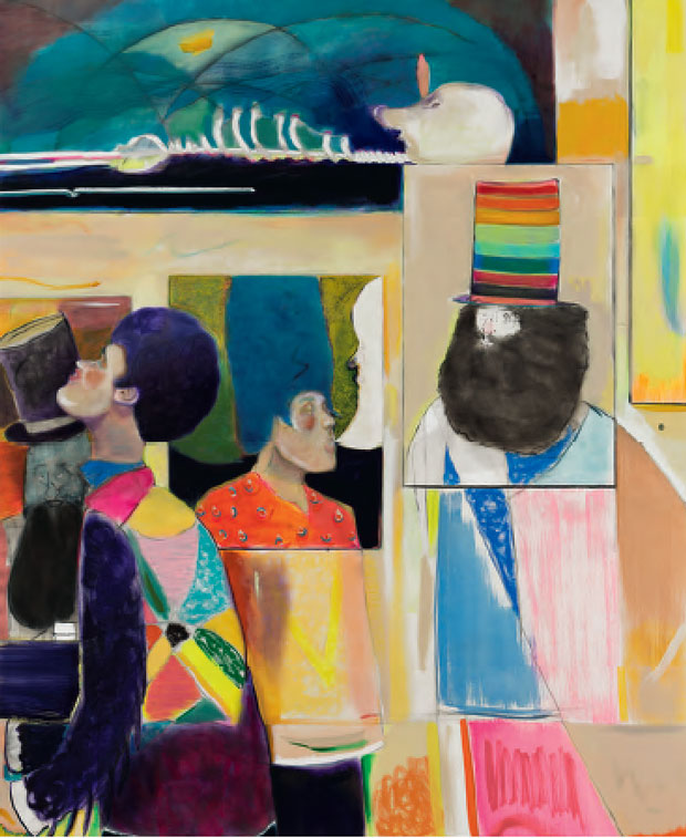
- Ryan Mosley
[ What’s on your mind right now? Lots of things are on my mind right now, in no particular order they are: getting the kids ready in time for nursery, walking the dogs, finishing off the paintings for an upcoming exhibition in Antwerp.
How do you get this stuff out? Sometimes it feels easy, you convince yourself of this, then you realise it's not. It's a constant flux of ideas that ferment - some take longer than others to be realised, some need more time to distill and eventually they appear in a drawing or in a painting much changed from how you initially thought. Sometimes you never get it out. It can sometimes feel like you're chasing your tail, getting out those imagined visions of how a painting will look.
That process in itself can throw up some interesting problems. So maybe it's a constant contradiction of how a day sets out and how it ends. You start with a positive,upbeat, hopeful outlook. You battle with the disappointments of things not quite happening as you would like and then sometimes you manage to get back to where you'd hope the work would be. I guess the real test is the following morning when you go back into the studio. It can be a pleasant surprise or total disbelief in the previous day's decision making. ]

Dance of the Nobleman, 2010-11
Posing For Conversation, 2016

Under a strange canopy, 2019
- Christina Quarles
I do draw from my own personal experience when making this work and I do that so I can be as specific as possible with the language that I develop and with describing the experience with living within your body so I really have my own set of experiences to draw from that. I would describe myself as being a cis-gender female, which is probably one of my more normal identities and as being somebody who is queer and as somebody who is racially multiple so I was born to a black father and a white mother. I would say that my racial position as somebody that identifies with both blackness and whiteness is often misidentified as white, has really informed the way that I think about living in a body and having these excesses of identities, starting to bubble up to the surface, I think of these as paintings of living within a disorganised body grappling with this sort of excess. ]

Are Hands, Are Tied (Our Hands, We Tried), 2018

Grounded by Tha Side of Yew, 2017
- Jorinde Voigt
[ In speaking about the guiding principle that informs the conceptual framework, Jorinde Voigt had described the search to find a structure or means of notation that behaves in the liveliest ways possible. After all, it is something living that is being observed. ]

Immersive Integral

5 Cavellini Sequences, 2015
Working principally within the medium of drawing, Voigt’s works have been likened to musical scores, scientific diagrams, or notational thought models. Using a precisely coded system of mark making, the artist gives pictorial form to an array of natural or psychological phenomena. In recent series, Voigt has applied her unique visual method in the deconstruction of works of literature and philosophical texts, highlighting specific words and passages that resonate with her. Voigt deems that language alone fails to adequately describe the complexities of what she perceives around her, and it is in her art that she finds a means to visually express her personal experience of the world.
The works in the exhibition demonstrate a new level of introspection for the artist, and find her engaging with elemental human experiences and yearnings. Her subjects include an analysis of the accumulated moments within a day, the desire to fly, and the human body. While making her series “Observations in the Now” (2015), the artist was intensely engaged with the writings of C. G. Jung, and in particular, his studies in human development and the concept of the unconscious. Using Jung’s psychological theories as a conceptual framework, Voigt approached the drawings in this group as thought diagrams, choosing certain colors – pinks and reds and greens – for their association with different emotional states.
The theme of flight has been present in Voigt’s work since 2007 when she made a drawing about the flight path of an eagle. More recently, the artist’s investigation into historical depictions of wings and flying led her to the work of Pietro Cavallini, whose fresco of The Last Judgment (c. 1293) comprises a host of angels within a highly specific organizational scheme. Inspired by the abstracted representation of the angels’ wings, Voigt made her monumental gold-leaf triptych, 5 Cavallini – Sequences (2015) which will be presented in the main gallery.
This interest in flying next led her to Der Heimatplanet (The Home Planet, 1988), a popular German book that documents the experiences of astronauts in space. Voigt recently rediscovered this book, having first read it as a child, and the unexpectedly poetic statements quoted from engineers onboard the spacecraft resonated with her. Of his experiences in space, one crewmember named Alexey Leonov observed the following: “What struck me most was the silence. It was a great silence, unlike any I have encountered on Earth, so vast and deep that I began to hear my own body: my heart beating, my blood vessels pulsing, even the rustle of my muscles moving over each other seemed audible.”
This deeply personal narrative style, which touches on bodily experience, takes another form in Voigt’s most recent work, März (2016), in which her physical form is the raw subject matter. Sitting atop a vast sheet of paper, the artist documents the areas in which her body comes into contact with it. Using her pencil-drawn outlines as precise guides, she applies pigment powder to form the colored areas with a cloth. As in her earlier series, “Observations in the Now”, the artist uses a color spectrum to describe her inner emotional states, guided by subjective associations as she decodes her own perception.'