I also love the actual concept of the show where the protagonist starts off the day by picking a planet - so essentially it’s all kind of a simulation? his body remains in his place but he gets sucked in to this world and so do we. the neon, very bright colours induce an almost hallucinatory feeling as we enter these bizarre worlds that is not scared of confronting gore. (not as centred as something like happy tree friends, but uses it in a way that is tasteful and striking. not to say that happy tree friends wasn’t amazing, it was. at the time it seemed these type of animations blew up - like the extremely disturbing salad fingers I still remember the creepy sound effects and scratchy voices)
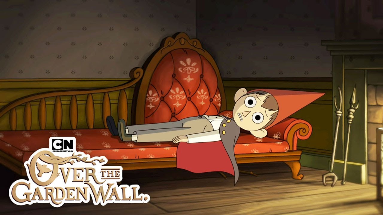
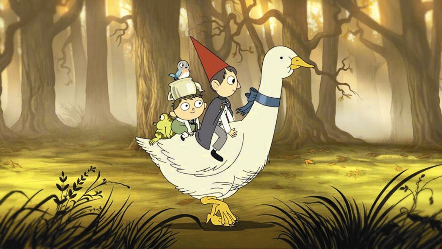
after watching over the garden wall I became more interested in watching animated series - which I’ve always been interested in, just haven’t been actively watching them as much - unless you count the occasional anime series - but I just admire people who work on these projects so much. courage the cowardly dog was ahead of its time, for sure. I think a lot of these gems were found in Cartoon Network. it’s sad that 2D animation styles are less seen these days - being slower and costly to produce. these days you can see the ditching on elsa’s clothes, crystal clear on the big screen. but this sentiment is not all lost, developers like the brothers who created cuphead, the game I love, created the game out of love from retro games and 1930s cartoons. also of course over the garden wall and the midnight gospel. I also enjoyed Bojack horseman immensely - the themes in that show - it tackled the celebrity life in every aspect and is really a raw watch. it made me feel a lot of things and I think it was a really successful show with numerous profound moments in it. I think when an animated series does that it’s something really beautiful because some people may look down on this genre, like it’s for kids, but really they can be so valuable to watch. also it can be easily hilarious and horrific and thought provoking at the same time.
anyway, I just thought the midnight gospel has something really special about it - I’ve never seen an animated series so brightly coloured it’s almost overwhelming. this type of aesthetic reminded me of kyary pamyu pamyu’s music videos (pioneer of kawaii and music in Japan and worldwide, when she came to London I went to her show for the first time and the theme was magnificent - traditional Japanese monsters it was like a theatre set) but she just released this new music video which I’m guessing is referencing the classic monkey king tale ? but the colours... also it looks like a theatre set.. I went ahead and looked at some of her older music videos too which are also amazing. at first it may seem all random and chaotic but the design of each element is just really clever how it all comes together.
side note I think one of the scenes below is referencing the red bathroom in the shining? I might be wrong. but I noticed that in an episode in bob’s burgers they also had a very clear reference to this as well. I love when artists borrow from other great works of art. there is so much value in ‘copying’ or ‘borrowing’. I watched a video from the art assignment that talks about this ‘copying’ which was also very valuable.
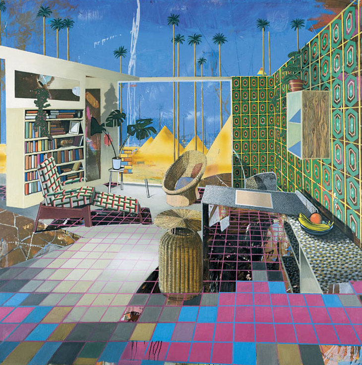
this also reminds me of the artist mentioned in tom’s now that’s what I call painting - Susanne kühn. her colours are usually very vibrant and the composition full and somewhat chaotic. but you can always locate the subject easily.
I feel that this sort of colour scheme and graphic look also speaks to video games and simulation and technology. (and in turn maybe Allison Goodyear’s works using google tilt brush) in the first episode we see the protagonist picks out the planet he wants to visit that day from the user interface. it felt very much futuristic and not far off (yet so far) from the technology we have now. also sort of sci-fi. the super computer talking is like many you see in sci-fi films.
with these colours, I am drawn to them visually and I feel that at some point my work has been sort of like this because I’m always indecisive about choosing colours - and I end up choosing every colour - which is what happened in ‘what doesn’t kill you’. though it worked for that one - it felt like a fever dream or hallucination. so I quite like that effect - though I’m realising lately I’m using less colours almost monochromatic or black and white.. a serene but also melancholic and quiet feeling and I quite like that. Being loud all the time must be tiring. I think my volcano painting sits somewhere on between. It’s loud but maybe more in a, you can feel it’s presence in the corner type of way. at least that’s how I feel. I feel it’s looking at me and burning away the never ending fire. which reminds me I need to watch synecdoche New York which Zoë recommended me watch and pay attention to the woman with the house that is always burning (?) or know that it’s gonna burn in the future (?) I need to watch it.


kyary pamyu pamyu music videos


This garden that I built for you..., 2016
Acrylic on canvas
220 × 130 cm
Tilo Baumgärtel


adventure time


over the garden wall