

then I actually did a rough 'wash' with the charcoal looking brush that I usually use, and erased some bits of it. I love this brush because there are so many details I usually look for in real paint that I am able to highlight/add shadows to. So I began to slowly do that, work with these traces from the erasure, and gradually I started to see forms emerging from the brushmarks. It was a very fun process and one that I've always enjoyed going through in physical paintings as well (usually in areas that are more flat in the photograph e.g. sky or wall).
I experienced it again, where I feel like I am live collaging (instead of how I usually approach it - with a preconceived image in mind and building up with pieces), I'd think of adding a flower stem here, and a train there, a swimming pool here, draw an eye there. This is quite new to me and I'm having fun with it - I do use reference images sometimes (in this case, the train image traced from galaxy express 999 manga - which is supposedly a train that travels through space, I haven't read or watched the series or film yet, a generic flower stem and swimming pool I found, the ogre type monster at the top right and the more anime like looking eye I drew from the shapes I saw from the marks), and with drawing each image on different layers I can then basically move that bit of the drawing around like a live collage, it's great.


train from the manga Galaxy Express 999 (銀河鉄道999)
I'm not sure if it's finished yet but this is how it looks so far:


playing around with hiding some layers and layer filters... I always
like at least one of the other variations from this experiment when I'm drawing.
I have selected quite a simple/limited colour palette because I was mainly focusing on exploring the pencil markings and how delicate you can get them on procreate. I had to add that red in there because I can't help adding a bit of tension/vilence in there for some contrast. in the end I don't know what I created here, it feels like I'm just roaming with my mind free, I guess you could call it a mind map, or an inner landscape (like bill viola talks about), and after thinking through my actual mindmap about the pandemic, maybe even a closer inspection of the nature (from the flower stem). I put in square brackets, flower expansion, because I felt like I was peeping into something that expanded into something much larger, bigger than life, like outer space.
the original 'I guess this is it for me' kind of became 'I GUESS THIS IS (IT FOR) ME' just referencing the train - when you part with someone on the train or anywhere, I guess you say, 'this is me', and get off, or change directions abruptly. just a sort of slightly existential double meaning with the idea of the journey mixed in there. and I like the uncertainty of 'I guess' because that's how I feel right now. when you're not confident enough about any aspect of your life, even the 'factual'. a certain uncertainty, that's what we're living in in these times. anyway, I love using brackets in my titles.
this kind of flatness in my drawing made me think of something I saw researching while I was taking notes for Charles Avery's interview on BBC radio (next post), the interviewer (the writer lavinia greenlaw) mentioned how his description of the work reminded her of Robinson crusoe (which led people to believe it as real adventures). This map of the island came up - and that just made me think more about the idea of the map (especially those of fantasy/fiction) and how it's supposed to show where things are, roughly, and how somethings are rendered strangely three- dimensional in this two-dimensional landscape. and you as the viewer are expected to venture into every hot spot on this provided map (in reading it as well). (side note - I always feel that when I'm reading a novel I never place it in a location in relation to other places - when I re-read harry potter one time and the map was at the front - I realised I've never thought about the places like this before and this was a brand new angle of looking at the adventures to be had..)
anyway, I thought about my drawing when I saw this map... no real location.. like a mind map? always shifting? (a mind map is quite abstract after all) traces, being born and forgotten constantly, fleeting time???
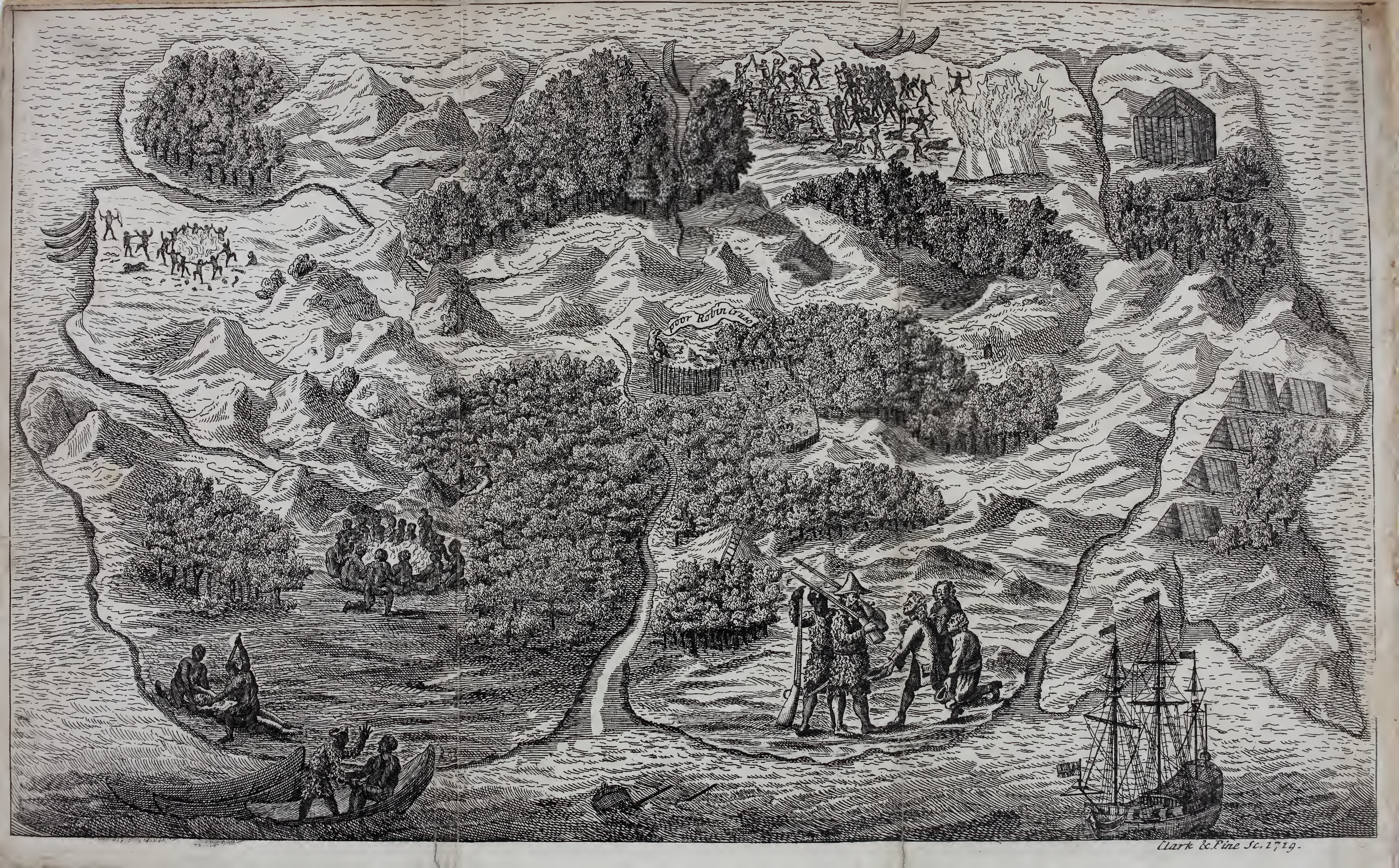
Pictorial map of Crusoe's island, the "Island of Despair", showing incidents from the book

it is interesting to see how one area is clearly dedicated to one school of people...
is it reflecting society? a lot of grey areas...

the battle royale map in the (English translation) book

forbidden zones detail

the digital map seen in the film version - a three dimensional mesh diagram similar to what
Diana Taylor was talking about in her materials
this also reminded me of the exquisite hand-painted mural (that acts like a map) in fantastic mr. fox, the very memorable shot of her painting those x's and flags... of course, wes anderson is known for his flat (+ symmetrical or satisfying) compositions...


images from the book I have, the making of fantastic mr. fox
"People who look for symbolic meanings fail to grasp the inherent poetry and mystery of the image. No doubt they sense this mystery, but they wish to get rid of it. They are afraid. By asking, 'What does this mean?' they express a wish that everything be understandable. But if one does not reject the mystery, one has quite a different response. One asks other things."
this might be a detour from maps but visually I feel that the garden of earthly delights, of course, is rich, extremely rich in symbolism, and I feel that its composition/layout reflects that of a map a little. you can see everything in an open perspective that's not quite real. yet it is believable. It is also detailed in every bit of the work, no matter how far into the horizon it is. everything is quite overwhelming this way, hard to navigate this map. taking it all in at the same time. (flashing back to what bill viola said about video works - the viewer can never receive a video in an instant, you can only ever see one frame at one time, and that is kind of melancholic)
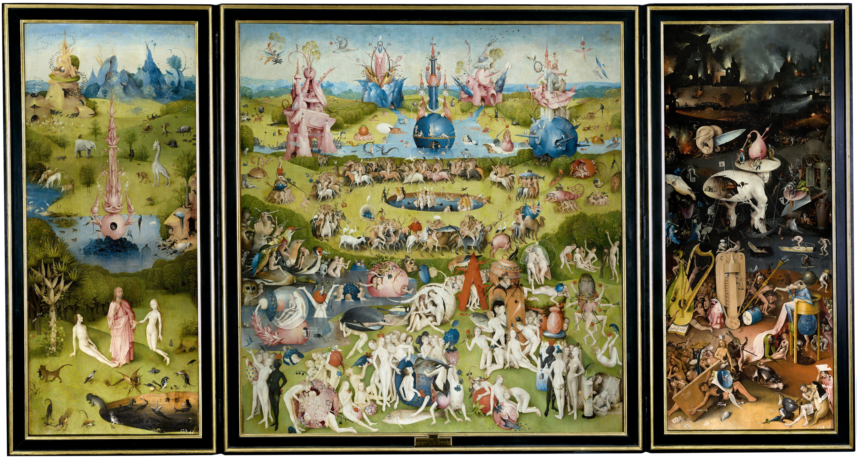
The Garden of Earthly Delights, Hieronymus Bosch

Ski Jacket, Peter Doig
I realised that I quite like this kind of perspective/layout, a lot of the contemporary Japanese artists I like use this... and often, when they use soft colours, it evokes an even more dream-like atmosphere because it is so unreal, or like another dimension that mirrors reality (like heterotopias?)
Aya Takano (recently discovered her from nel's thesis on contemporary Japanese art, so inspirational)

Aya Takano (recently discovered her from nel's thesis on contemporary Japanese art, so inspirational)

FLOATING IN A FIELD OF PRIMITIVE LIFE, 2014, oil on canvas, 91 x 116.7 cm

EDIBLE PLANT GARMENTS, GUARDIAN DEITIES, 2014, Oil on canvas, 116 x 91 cm

ALL WAS LIGHT, 2012, Oil on canvas, 194 x 130.3 cm
(more on her work in another post*)
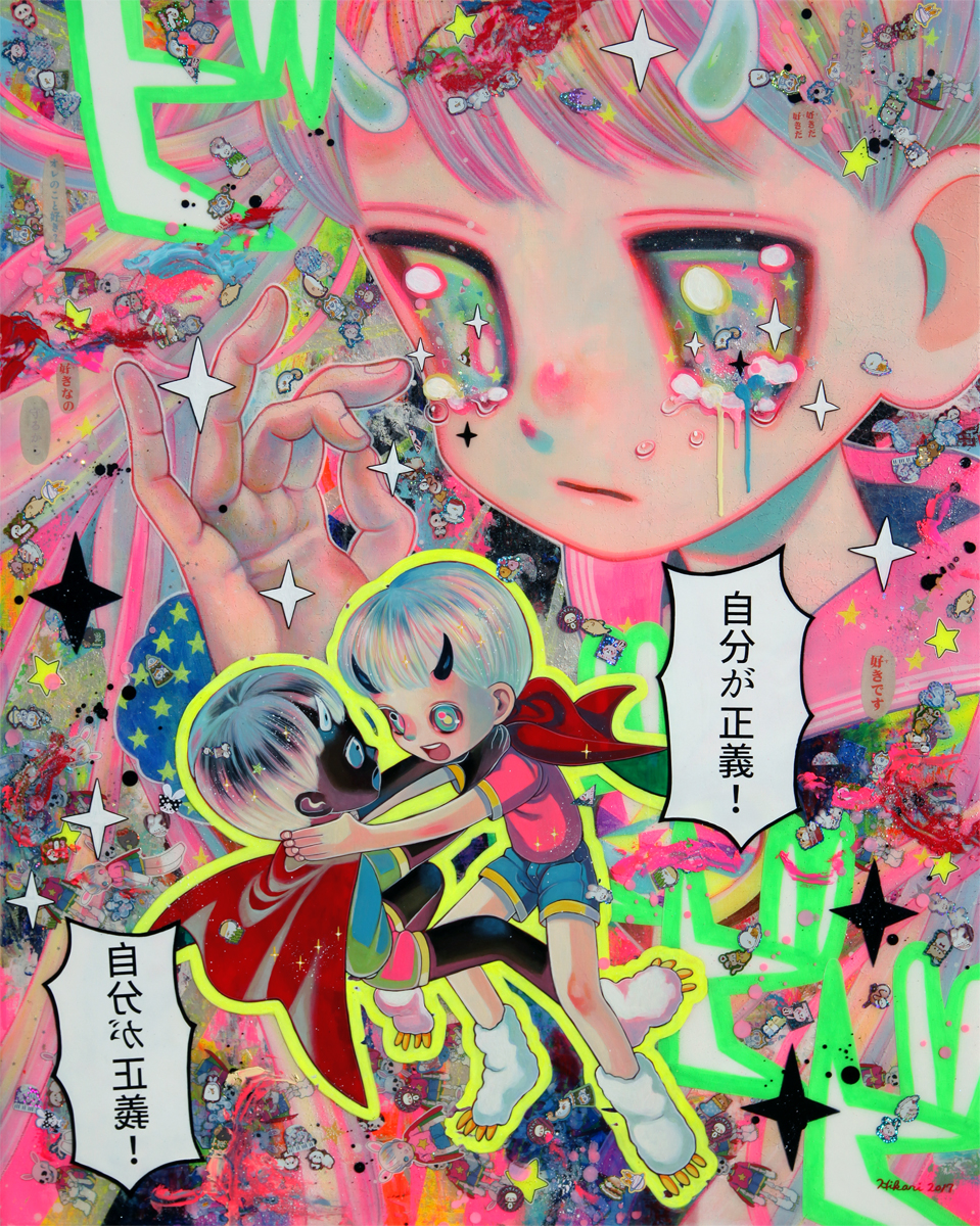
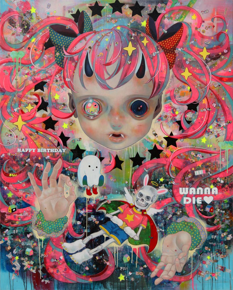
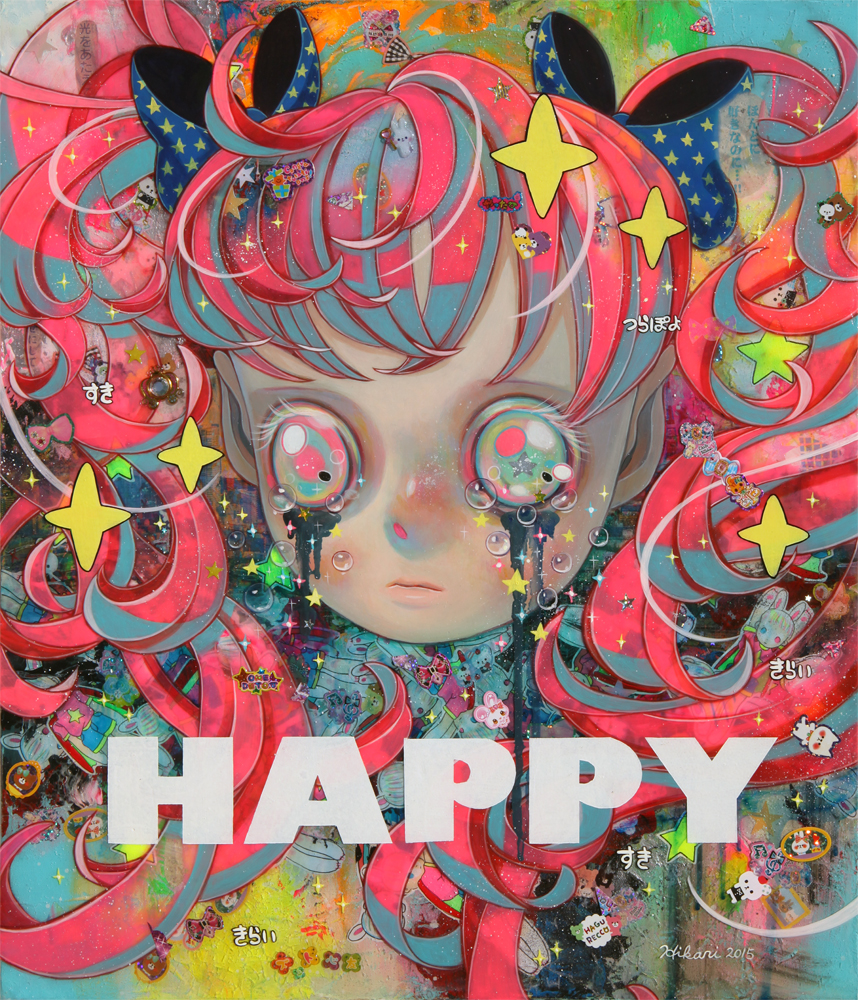
Hikari Shimoda (one of my favourite artists)

Neo Raigou-zu, Mixed media, 44.1" x 57.3", 2018

Evolution of the Arbitrator, Mixed media, 44.1" x 57.3", 2018
Where a Sword Named Justice Points, Mixed media, 35.8" x 28.6", 2018
Recycling Humanity, Mixed media, 64" x 51", 2016
Inverted World, Mixed media, 21" x 18", 2016

All Alive, Mixed media on canvas, 9.9" round, 2015

Following the Great East Japan Earthquake and accident of Fukushima Nuclear Power Plant in 2011, Shimoda became increasingly interested in various connections in the world. In her portrait series “Whereabouts of God”, featuring other-worldly children adorned with a Chernobyl necklace, and “Children of This Planet”, children act as a blank canvas for what she describes as countless possibilities; where fantasy meets with reality, past meets future, life meets death, and a world that is yet to be reborn. Not only do eyes communicate each character’s personality, they are also a reflection of Shimoda’s own feelings and ideas:
“They are “anyone” who just exists. So, they could also exist beyond the realm of being children, and identify with anyone who might appreciate them. Those children who are wearing a vacant expression of despair and solitude are mirroring the emotions of the people who look at them. Those vacant children are, so to speak, “cups of my emotions”- something which I could pour my emotion into. Their sparkling eyes are staring into space, while reflecting both light and darkness, and those horns are a metaphor of wordless emotions like fury and despair that people feel towards unreasonable things in this world.” With each new piece, Shimoda advances her search for salvation and her deeper understanding of this chaotic world.'
----------------------------------------------
anyway, I may have gone a little off-track but drawing that drawing made me think of soft colours/the opposite end (fluorescent), flat rendering/composition, the map/symbolism... I wonder if I should plan my drawings like I would with a painting (more like map) or just do it without thinking (more like mind map), and the thing about working in procreate is, the line between drawing and painting is very blurred. I'll have to think about this...